Simple Nutrition is a rebrand for a meal-prep business that is transitioning to a meal-coaching business.
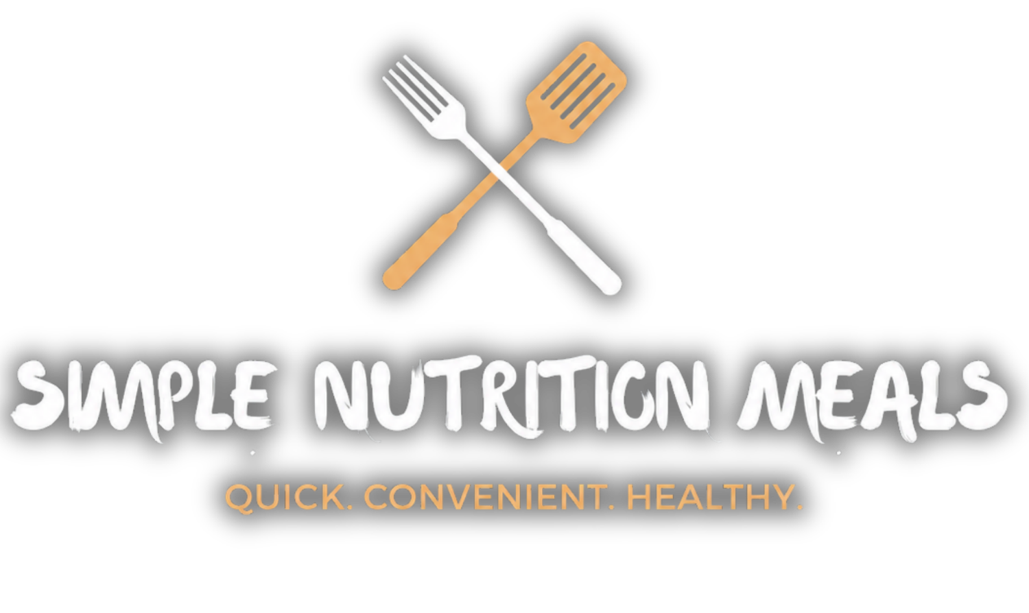
The original branding was designed around meal preparation services and no longer represented the business's shift toward one-on-one nutrition coaching. While the owner wanted a fresh, more feminine look that would appeal to their target audience, it was equally important that existing clients still recognized the brand they knew and trusted. The challenge was finding the balance between introducing a new identity and maintaining brand recognition.
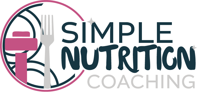
The new brand identity builds on the familiarity of the original logo while introducing softer colors, refined typography, and subtle design details that better communicate an approachable, supportive coaching experience. Rather than creating a completely new identity, the redesign intentionally retained recognizable visual cues, allowing the brand to evolve naturally while emphasizing its new focus on personalized nutrition coaching over meal preparation.
The refreshed identity positions Simple Nutrition Coaching as a modern, welcoming brand that reflects its expanded services and ideal clientele. The updated branding creates a stronger emotional connection with prospective clients while reassuring existing customers that the trusted business behind the logo remains the same. The result is a cohesive brand that supports future growth and clearly communicates the business's evolution from meal prep to nutrition coaching.